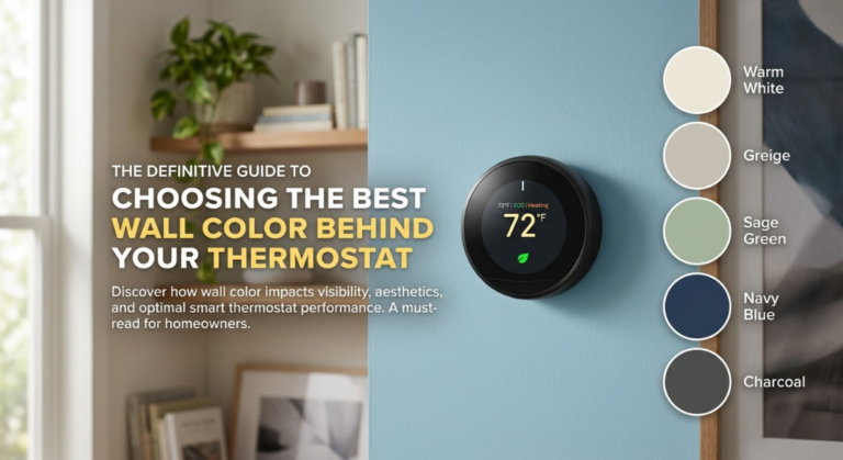
The Wall Behind the Dial
The Definitive Guide to Choosing the Best Wall Color Behind Your Thermostat
A complete guide to color, contrast, camouflage, and style
Introduction
Most homeowners spend months selecting the perfect wall color — agonizing over undertones, lighting conditions, and finish sheens — only to overlook one small but stubbornly visible detail sitting right at eye level: the thermostat.
It clings to the wall like an afterthought. A rectangular plastic rectangle in beige, white, or matte black, mounted at eye level in a hallway, living room, or bedroom — exactly where your carefully chosen wall color is most visible. And yet, despite its prominent placement, the thermostat is almost never factored into paint decisions. The result, more often than not, is a beautiful room interrupted by a device that looks like it belongs in a utility closet.
This guide changes that. Over the following pages, we will explore the full relationship between wall color and thermostat visibility — how paint tones either amplify or absorb a thermostat’s presence, how different finishes interact with plastic and metal housings, and which specific paint colors designers and decorators use to create a seamless, intentional-looking wall.
We will also cover the science behind why certain color combinations work, the psychological effects of contrast versus camouflage, room-by-room recommendations, expert tips for renters and homeowners alike, and an in-depth look at the top paint colors — with specific brands and shades — that professionals recommend most often.
Consider this the guide you wished you had before painting your walls.
Understanding the Problem
Why the Thermostat Always Stands Out
Before we can solve the visual problem of the wall thermostat, it helps to understand why it stands out so reliably in the first place. The answer lies in three compounding factors: contrast, placement, and shape language.
Contrast is the most immediate issue. Most thermostats are manufactured in white, off-white, or light beige — colors selected for universality rather than aesthetic compatibility. When these pale plastic housings are mounted on a wall painted in any medium or deep tone, the contrast between the device and the surface is immediate and unavoidable. The eye, which naturally gravitates toward contrast, goes straight to the thermostat.
Placement compounds the problem. Thermostats are typically installed between 52 and 60 inches from the floor — exactly eye level for the average adult. This is precisely the zone where the eye naturally scans a room when entering. Unlike a smoke detector mounted near the ceiling or an outlet at baseboard level, the thermostat sits squarely in the focal plane of the wall, making it impossible to overlook.
Shape language is the third factor. Walls are large, flat, continuous planes. Thermostats are small, rectangular, slightly three-dimensional objects with visible edges, shadow gaps, and hardware details. Their geometry interrupts the smooth visual field of a painted wall in a way that feels intrusive — not because they are large, but because they are foreign to the surface they occupy.
Together, these three factors create a device that punches above its weight visually, drawing attention disproportionate to its actual size. The solution is not to eliminate the contrast entirely, but to manage it through intelligent wall color selection.
The Thermostat’s Role in Interior Design
Historically, interior design has treated the thermostat as a non-element — a practical necessity that falls outside the scope of aesthetic consideration. Designers would plan a room’s color palette, source furniture and textiles, select lighting and accessories, and only at the installation phase notice that the thermostat needed to be accounted for. By then, the paint was already on the walls.
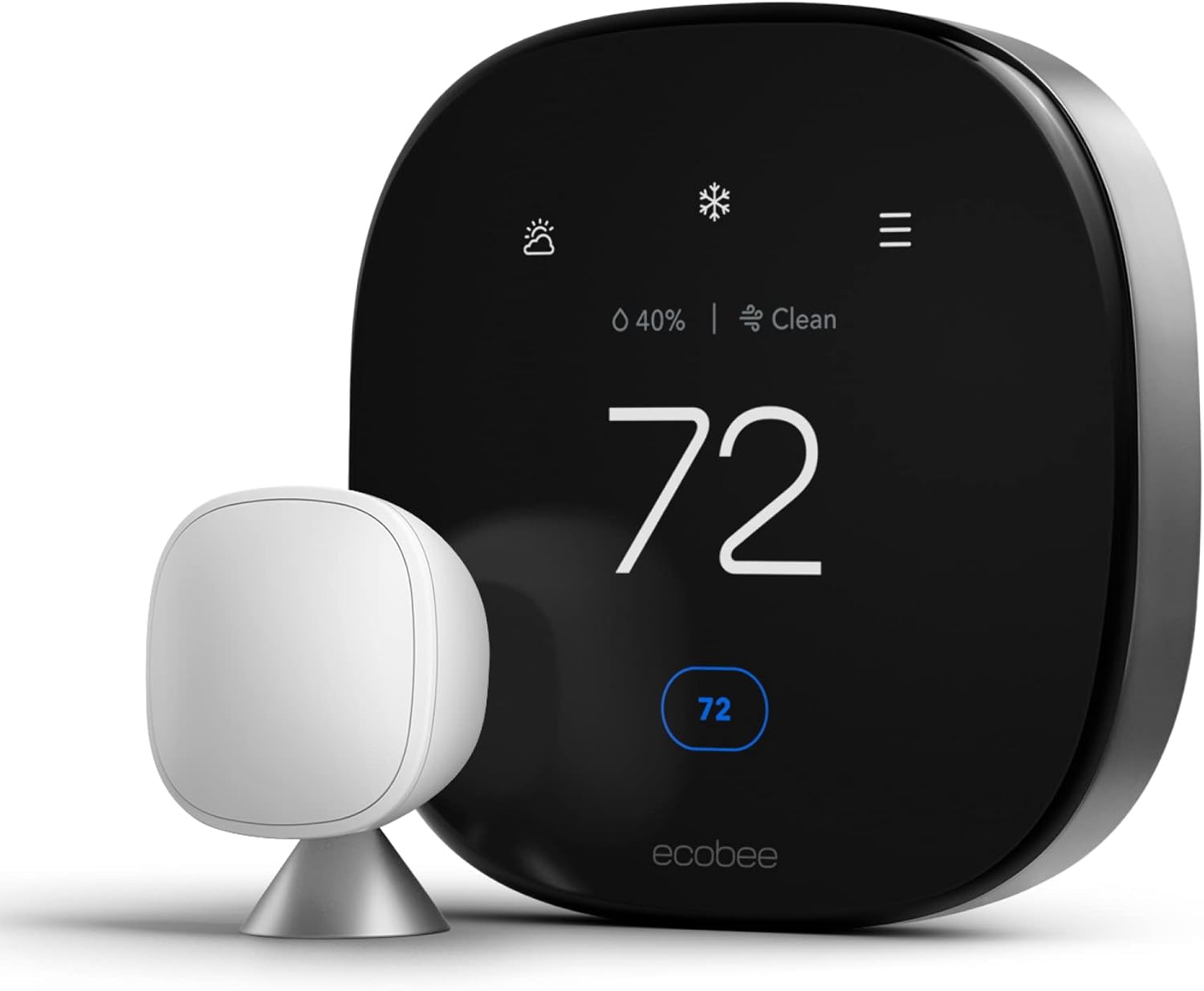
This approach is increasingly untenable for two reasons. First, the rise of smart thermostats has made the devices physically larger and more visually complex. A Nest Learning Thermostat, with its circular stainless steel body and glowing display, is a more prominent object than the flat rectangular units that preceded it. An Ecobee with its touchscreen is essentially a small tablet mounted to the wall.
Second, the explosion of content around interior design — driven by social media platforms, home décor blogs, and renovation television — has raised the bar for what homeowners notice and care about. Rooms are photographed and shared in ways they were not a generation ago. Every detail is scrutinized.
“The right wall color doesn’t just make a room feel beautiful — it determines whether the thermostat looks like a design choice or an accident.”
This shift in awareness has led to a small but growing body of knowledge around thermostat-compatible wall colors — colors that either camouflage the device by reducing contrast, or frame it in a way that makes it feel intentional. This guide synthesizes that knowledge into actionable recommendations. If you are also considering how to disguise the device beyond paint, our companion guide to 25 thermostat cover ideas that actually blend into your home offers decorative solutions to use alongside or instead of a repaint.


The Color Science of Camouflage
How Paint Colors Interact With Thermostat Finishes
To choose the best wall color behind a thermostat, it helps to understand the basic science of how we perceive color contrast — and how that contrast is affected by the specific finish of the thermostat housing. If you are curious about the broader mechanics of how thermostats work and why their placement matters, our primer on how thermostats work provides useful context.
Most thermostat housings are made from ABS plastic, which is injection-molded and painted or coated in a surface color. The most common colors are: standard white (a cool, blue-toned white), off-white or ivory (a warmer, slightly yellow-toned white), light beige or putty (a warm gray-beige blend), and matte or gloss black. Smart thermostats like the Nest add stainless steel and aluminum to the material palette, introducing metallic surfaces that interact with light differently than painted plastic.
The key principle at work is simultaneous contrast — the phenomenon whereby a color appears lighter or darker, warmer or cooler, depending entirely on the colors that surround it. A white thermostat on a bright white wall may actually appear slightly yellow or gray by comparison. The same thermostat on a deep charcoal wall will appear to glow with a harsh brightness. On a warm greige wall, it will settle into the surface more gently because the warm undertones in the paint echo the warm undertones in the plastic casing.
Undertones: The Hidden Variable
Undertones are the single most important variable in thermostat-to-wall compatibility. Every paint color has an undertone — a subtle secondary hue that influences how the color reads in context. A white paint labeled “bright white” may have blue, green, or yellow undertones depending on its formula. These undertones are often invisible when you look at a paint swatch in isolation, but become immediately apparent when the color is placed next to another surface.
Thermostat casings also have undertones. Standard white plastic tends toward cool blue-white. Off-white and ivory casings lean warm. Beige casings carry yellow or tan undertones. When the undertone of the wall paint clashes with the undertone of the thermostat casing, the device appears to “pop” from the wall even when the values are similar. When the undertones match or harmonize, the device recedes.
Always hold a paint swatch directly against your thermostat casing in the actual room lighting before committing to a color. What looks harmonious in daylight may clash under artificial light.
This is why many homeowners are surprised to find that painting their walls a warm white — rather than a cool, bright white — dramatically reduces the visibility of a standard off-white thermostat. The warm undertones in the paint match the subtle warmth in most plastic casings, creating a visual echo that softens the contrast.
Value Contrast and Visual Weight
Beyond undertones, the lightness-to-darkness relationship between wall and thermostat — what color theorists call value contrast — determines how much visual weight the thermostat carries. High contrast creates high visual weight; low contrast creates low visual weight.
When a white thermostat sits on a deep-colored wall — forest green, charcoal, navy — the value contrast is extreme and the device appears to float forward from the surface. Low-value contrast — achieved by matching the thermostat’s approximate lightness with the wall color — reduces visual weight significantly. The sweet spot for camouflage is a wall color that matches the thermostat in lightness while harmonizing with it in undertone.
This principle has an interesting corollary: very dark thermostats (matte black smart devices, for instance) are actually easiest to camouflage on deep-colored walls. A matte black thermostat on a charcoal or deep navy wall virtually disappears.


The Best Wall Colors, Room by Room
Universal Performers: Colors That Work Everywhere
Before diving into room-specific recommendations, it is worth identifying the wall colors that reliably minimize thermostat visibility in virtually any context — colors that work because they occupy the middle ground between contrast and camouflage, harmonize with most thermostat finishes, and complement a wide range of interior styles.
Warm Greige
Greige — the portmanteau of gray and beige — is consistently the most recommended wall color category for thermostat compatibility. A well-chosen greige occupies a color temperature sweet spot: it is neither cool enough to clash with warm-toned plastic casings, nor warm enough to make cool-toned devices look stark. Its middle-gray value creates low contrast against both white and off-white thermostats, while its subtle warmth mirrors the yellow and brown undertones found in most plastic casings.
Top Greige Picks
Soft and Warm Whites
Not all whites are created equal, and for thermostat camouflage purposes, warm whites dramatically outperform cool whites. A warm white — one with yellow, cream, or pink undertones rather than blue or green — creates a tonal match with most thermostat casings that cool whites simply cannot achieve.
Best Warm White Picks
Muted Sage Green
Sage green has emerged as one of the most popular wall colors of the past five years, and its thermostat-compatibility is one underappreciated reason for its staying power. The muted, gray-green tones of a true sage paint create a sophisticated backdrop that draws the eye to the color itself rather than to contrast points on the wall.
Best Sage Green Picks
Living Room Recommendations
The living room presents a unique challenge because it is typically the largest wall in the home and the one most photographed, scrutinized, and styled. Thermostats in living rooms are often situated on accent walls or primary feature walls — exactly where design decisions carry the most weight.
For living rooms, the priority is usually aesthetic harmony over pure camouflage. Rather than making the thermostat invisible at all costs, the goal is to ensure it reads as part of an intentional color story. Deep, saturated colors are more viable in living rooms than in hallways or bedrooms, because the room has enough visual complexity — furniture, art, textiles — to absorb the contrast of a white thermostat without it becoming the focal point.
In living rooms with gallery walls, the thermostat can be incorporated into the gallery arrangement using a hinged frame — making the color of the wall behind it largely irrelevant. This is the designer’s favorite solution when the wall color is already committed. See our full guide to thermostat cover ideas for more framing and concealment techniques.
Hallway Recommendations
Hallways are the most challenging room for thermostat camouflage for one simple reason: they are narrow. In a narrow hallway, the eye has nowhere else to go. The thermostat — mounted at eye level — sits squarely in the sightline of anyone walking through, with no furniture or art to redirect attention. You may also want to address the wires trailing from the device; our guide on how to hide thermostat wires on your wall covers this companion problem comprehensively.
In hallways, camouflage is the priority. The most effective hallway colors are those that closely match the thermostat’s value (lightness) while harmonizing its undertone.
Best Hallway Colors
Bedroom Recommendations
Bedrooms offer more flexibility than hallways because the thermostat is rarely the first thing you see upon entering. Beds, headboards, and windows typically command the eye first. Bedrooms also tend toward softer, more atmospheric color palettes — pale blues, soft blushes, gentle lavenders, and organic greens are common choices that, being on the lighter end of the value scale, provide relatively low contrast against white and off-white thermostats. The ideal room temperature for sleeping is another consideration that can influence how prominently your thermostat figures into the bedroom experience.
Best Bedroom Colors
Bold Colors and the Strategic Thermostat
When Dark Walls Work in Your Favor
The conventional wisdom on dark walls and thermostats is that they are incompatible. This is not entirely true. In the right context, dark walls can work strategically to neutralize the thermostat’s visual prominence through a mechanism that seems counterintuitive: distraction.
When a wall is painted a rich, saturated, deeply chromatic color — think ink navy, forest green, charcoal, or warm black — the color itself becomes so visually dominant that the eye adjusts its baseline. The room’s entire value range shifts downward, and the white thermostat, while still high-contrast, is now one of several light-toned elements competing for attention alongside light switch plates, outlet covers, crown molding, and trim.
The key is consistency: if the thermostat is the only white element on a dark wall, it reads as an intrusion. But if the wall also includes white or light-toned trim, outlet covers, and architectural details, the thermostat becomes part of a coherent pattern of lighter elements against the dark surface. It belongs.
The Technique of Color-Matching Thermostat Plates
One of the most elegant solutions available to design-conscious homeowners is the replacement thermostat plate — a cover designed to mount over the existing thermostat housing in a custom color or finish. Many thermostat manufacturers and third-party suppliers offer interchangeable faceplates in a range of colors, allowing the device to be matched almost exactly to the wall behind it.
For non-smart thermostats, the simplest and most affordable solution is to paint the thermostat plate directly. This requires removing the plate from the wall, lightly sanding the surface, priming, and applying the same paint used on the wall. The result is a thermostat that reads as an architectural element rather than a device.
Before painting a thermostat plate, check the manufacturer’s warranty. Some manufacturers void warranties if the device is painted. The safest approach is to paint only the removable outer cover, not the thermostat body itself. If you suspect your thermostat may be due for replacement rather than a cosmetic refresh, our guide on how to know if you need a new thermostat can help you assess its condition first.
“On a dark wall, a white thermostat doesn’t disappear — but a dark one does. Sometimes the boldest color choice is the one that makes you invisible.”
Terracotta, Rust, and Warm Earth Tones
Warm earth tones — terracotta, burnt sienna, clay, ochre, rust — present a unique situation for thermostat compatibility. These colors are warm and saturated enough to create significant contrast against a white thermostat, yet their organic, imperfect quality means the eye is less bothered by the juxtaposition than it would be with a cool, graphic color like navy or charcoal.
Best Earthy Tones
Finish, Texture, and the Wall Behind the Device
How Paint Finish Affects Thermostat Visibility
The finish of a wall paint — matte, eggshell, satin, semi-gloss — has a surprisingly significant effect on how visible a thermostat appears. Different finishes interact differently with light, and it is light that creates the shadow gap between the thermostat and the wall that telegraphs the device’s presence.
Matte finish, with its flat, non-reflective surface, minimizes shadow visibility and reduces the apparent three-dimensionality of objects mounted to the wall. A thermostat on a matte wall casts softer, less defined shadows than the same device on a glossy wall. For thermostat camouflage, matte finish is almost always the best choice.
Eggshell and satin finishes — the most common choices for high-traffic walls because of their washability — fall in the middle range. Their slight sheen creates some shadow definition around mounted objects, making the thermostat marginally more visible. This difference is subtle in rooms with diffuse lighting and becomes significant only in rooms with strong directional light sources.
Semi-gloss and gloss finishes are the most challenging for thermostat camouflage. The reflective surface creates sharp shadow definition around the thermostat’s edges, essentially outlining the device in shadow. If a gloss finish is desired, the thermostat should be covered with a decorative frame to manage the shadow gap.
Textured Walls and Their Effect
Textured wall surfaces — whether from skip-trowel plaster, knockdown texture, or Venetian plaster techniques — create a different visual challenge. The texture itself provides a visual pattern that competes with the thermostat for attention, often successfully. On a heavily textured wall, the thermostat’s edges are less visually distinct because the surrounding texture creates a field of similar visual complexity.
Lime wash and mineral paint finishes are particularly effective at this. Their characteristic cloudy, variable color creates a surface that reads as a continuous organic field, absorbing mounted objects into the visual pattern. A thermostat on a lime-washed wall reads as embedded in the material rather than affixed to it.
Wallpaper Considerations
Patterned wallpaper — particularly wallpapers with large, bold, or complex patterns — is one of the most effective backgrounds for thermostat camouflage, for the same reason that textured paint works: it provides competing visual information that overwhelms the small, simple rectangle of the thermostat. Against a field of botanical print or geometric wallpaper, a thermostat is genuinely difficult to find unless you know where to look.
The recommended approach with wallpaper is to stop the installation at the thermostat’s location and create a clean painted border around the device — or to frame the thermostat with a decorative surround that covers the wallpaper-to-device transition.
Smart Thermostats and Premium Finishes
Designing Around the Nest, Ecobee, and Other Smart Devices
Smart thermostats occupy a different visual category than their traditional counterparts, and they require a different approach to wall color selection. Unlike standard rectangular plastic units, smart thermostats are designed objects — devices whose manufacturers have invested heavily in form, material, and finish in order to create devices that are not just functional but desirable. For a side-by-side evaluation of the two dominant platforms, our Nest vs Ecobee comparison breaks down their distinct visual and functional approaches.
The Nest Learning Thermostat was conceived from the beginning as something closer to a consumer electronics accessory than a utility device. Its circular form, stainless steel ring, and polished or mirrored face are deliberately reminiscent of a luxury watch face. Because the Nest is designed to be seen, the goal of wall color selection shifts from camouflage to complementarity.
The stainless steel and polished finishes of the Nest Learning Thermostat are most at home on cool-toned or neutral walls — slate gray, soft blue-gray, warm greige, or deep navy. These colors echo the cool metallic quality of the device and create a coherent visual relationship.
The Ecobee Smart Thermostat Premium, with its large rectangular touchscreen, is closer in form to a traditional thermostat but benefits from the same complementarity approach. Its matte black frame and crisp white screen work particularly well on medium-depth wall colors that provide enough contrast against the black frame to make it legible. Features like adaptive learning and geofencing make these devices worth displaying rather than hiding — another argument for the complementarity approach.
The Case for Intentional Contrast
Not all designers seek to minimize the thermostat’s visibility. A growing school of thought in contemporary interior design argues for intentional contrast — using the thermostat as an opportunity to introduce a deliberate punctuation mark on the wall, rather than trying to erase it.
A Nest with a stainless steel ring on a deep navy wall, for instance, reads as an intentional moment of metal against color — not unlike a small piece of wall-mounted sculpture. For this approach to succeed, the thermostat must be the only intrusive element on the wall. Light switch plates, outlet covers, and other wall hardware should all be upgraded to matching finishes.
If you are embracing intentional contrast, replace all outlet covers and light switch plates with matching hardware in the same finish as your thermostat. This single change elevates the entire wall from utilitarian to designed.


Expert Paint Color Recommendations by Thermostat Finish
For White and Off-White Thermostats
The standard white or off-white thermostat is the most common unit in American homes, and fortunately, it is also the easiest to work with. The most important principle: avoid cool whites. A cool white wall against an off-white thermostat creates a subtle but persistent clash that makes the device appear slightly yellowed.
Top Picks for White/Off-White Thermostats
For Black and Dark Thermostats
Matte black smart thermostats are ideally paired with wall colors that provide moderate contrast without overwhelming the device’s dark finish. Deep, saturated wall colors are the most natural choice, as they reduce the relative contrast between the dark thermostat and its background. For homeowners comparing Nest vs. Honeywell or Wyze vs. Ecobee, finish color is often the deciding aesthetic factor once the functional specs are aligned.
Top Picks for Black/Dark Thermostats
For Chrome and Metallic Thermostats
Metallic thermostat finishes — stainless steel, brushed nickel, chrome — interact differently with wall color than painted plastic. Metal surfaces are partially reflective, meaning they take on some of the color of the surrounding wall. A stainless thermostat on a warm greige wall will reflect warm tones in its surface, creating a more harmonious relationship than a cool wall would allow.
Top Picks for Metallic Thermostats


Practical Considerations for Renters and Homeowners
Renter-Friendly Approaches
For renters who cannot paint their walls, the wall color behind the thermostat is fixed — typically a landlord-standard white or off-white. In most cases, this means the thermostat and the wall share similar tones, which actually reduces contrast naturally.
Renters have several options that do not require paint. Removable wallpaper (also called peel-and-stick) can be applied to the wall behind the thermostat, creating a decorative backdrop that draws the eye and contextualizes the device. Botanical prints, geometric patterns, and textured options are all widely available and completely damage-free.
Decorative thermostat frames — also called thermostat cover plates or surround kits — are another renter-friendly option. These frame-shaped covers mount over the existing thermostat to create a finished, intentional appearance. Many are available in brushed gold, matte black, and white finishes, and they do not require any modification to the thermostat itself. Our complete thermostat cover ideas guide features 25 specific approaches, many of which are specifically designed for rental situations.
Homeowner Upgrades Worth Considering
For homeowners with full control over their paint choices, the most impactful upgrades are often simpler than they expect. The following changes, ranked by impact and ease of implementation, represent the best return on investment in thermostat-to-wall harmony:
- Repainting the thermostat wall in a warm neutral or greige — a single gallon of paint and an afternoon of work — reduces thermostat visibility by 40 to 60 percent in most cases.
- Replacing the thermostat’s standard cover plate with one that closely matches the wall color, available from most thermostat manufacturers and many home improvement retailers.
- Installing a decorative frame surround that matches the room’s trim color, creating a visual “housing” for the thermostat that makes it read as an architectural element.
- Upgrading nearby outlet covers and light switch plates to matching finishes, unifying all wall hardware into a coherent visual system.
- Using the same paint color on the thermostat’s cover plate as on the wall — the most labor-intensive but most effective camouflage technique available.


The Psychology of Color and Thermostat Perception
How Wall Color Affects Temperature Perception
There is a dimension to the thermostat-wall relationship that extends beyond aesthetics and into psychology — one that has practical implications for how comfortable we feel in a room and how we interact with the device that controls its temperature.
Color psychology is a well-established field, and its findings are directly applicable to the question of thermostat visibility. Our perception of temperature is partly cognitive, influenced by the visual environment around us. Rooms painted in warm hues — terracotta, rust, amber, deep coral — are consistently rated as feeling warmer than identically heated rooms painted in cool tones, even when the actual air temperature is identical. This effect, documented in studies from the 1970s onward, is strong enough that participants in controlled experiments have been found to adjust their thermostat set points depending on the color of the walls around them.
This connection between wall color and perceived temperature has a practical implication for thermostat choice: the wall color you choose does not just affect how the thermostat looks. It affects how much you interact with it. Understanding the recommended thermostat settings for winter alongside your room’s color psychology can help you create a space that feels comfortable at lower energy costs.
Rooms with warm wall colors tend to encourage occupants to set thermostats lower in winter, because the room already feels warmer than it is. Cool-toned rooms encourage the opposite — occupants tend to seek slightly higher thermostat readings to compensate for the visual impression of coldness. If energy efficiency is among your priorities, the color of the walls around your thermostat is not merely an aesthetic consideration. In fact, our research on how a smart thermostat saves money shows that behavioral nudges — including visual environment — can contribute meaningfully to annual energy savings.
Visual Salience and Cognitive Load
There is also the question of salience — how much a visible thermostat occupies your conscious attention. Research on visual saliency suggests that high-contrast objects in the middle of a wall at eye level are among the most attention-capturing visual stimuli in a domestic environment. When the thermostat is highly visible, it operates as a constant, low-level prompt to think about temperature — to notice whether it is too warm, too cool, whether it should be adjusted. Reducing the thermostat’s visual salience through intelligent wall color selection literally reduces the cognitive intrusion of the device.
This effect is particularly relevant in bedrooms. Sleep research consistently identifies ambient temperature as one of the most important variables in sleep quality. The ideal room temperature for sleeping is between 60 and 67 degrees Fahrenheit for most adults, but the psychological environment of the bedroom — including the visual presence of the thermostat — can affect how readily you achieve the mental state needed for restful sleep. A thermostat that is visually prominent in a bedroom can serve as a subtle sleep disruptor, a reminder of home management anxiety at precisely the moment you wish to wind down.
For this reason, bedroom wall colors that minimize thermostat visibility serve a functional purpose beyond aesthetics — they contribute to the sleep environment’s psychological calm.
The Anxiety Dimension — Thermostat Visibility and Home Management Stress
The anxiety dimension extends beyond bedrooms. In any room where a thermostat is prominently visible, its presence can trigger what behavioral researchers call cue-reactive thinking — the device becomes a cue that prompts thoughts about energy costs, temperature discomfort, or household management tasks. A thermostat that blends into its wall eliminates these cues, creating a subtle but measurable reduction in ambient cognitive load.
Paradoxically, the best solution for this psychological dimension is not necessarily to hide the thermostat, but to give it an appropriate presence. A thermostat framed intentionally — in a decorative surround that signals design intent — activates a different cognitive response than one that looks accidental or overlooked. The former says: “this is under control.” The latter says: “this was forgotten.”
The solution, in all these cases, comes back to the principles outlined in earlier chapters: reducing contrast, harmonizing undertones, selecting a wall color that absorbs the thermostat into its visual field rather than presenting it as a contrasting foreground object — or, where contrast is unavoidable, framing it deliberately so that it reads as a choice rather than a compromise.
Light, Room Orientation, and How Your Wall Color Will Shift
Why the Same Paint Color Looks Different in Every Room
One of the most common mistakes homeowners make when selecting paint colors is evaluating swatches under a single light source — usually the overhead fluorescent of a paint store — and then applying the color to a room where the lighting conditions are entirely different. The result is a color that looks nothing like the swatch, and a thermostat that is either more or less visible than anticipated.
Understanding how light interacts with paint color — and how that interaction changes based on room orientation, time of day, and artificial light type — is essential for making a wall color choice that will deliver the intended thermostat-compatibility effect throughout the entire day.
North-Facing Rooms
North-facing rooms receive no direct sunlight. The light they receive is indirect, reflected, and predominantly cool-toned — the blue-gray quality of diffuse skylight. In north-facing rooms, warm wall colors shift cooler than they appear in a paint store, and cool colors become quite cold. This creates a specific challenge for thermostat camouflage: a warm greige that looked like a perfect match for your off-white thermostat in the store may appear noticeably cooler on your north-facing hallway wall, increasing the contrast with the warm undertones of the thermostat casing.
For north-facing rooms, it is recommended to select wall colors that are one step warmer than your target undertone. If you are aiming for a neutral greige, choose a slightly warm beige. If your target is a soft sage, choose a version with slightly more yellow in its formula. The cool light will neutralize the extra warmth, landing the color closer to your intended effect. This is also the reason why north-facing rooms often require careful thermostat placement and calibration — the cool, shaded conditions can affect how accurately the device reads ambient temperature.
South-Facing Rooms
South-facing rooms receive the most direct sunlight, and their light is warm and golden — particularly in the afternoon hours. Warm wall colors become luminous and rich in south-facing rooms; cool colors are neutralized and can appear almost warm. South-facing rooms are the most forgiving for thermostat compatibility because the warm light tends to warm the entire wall, reducing the apparent contrast between wall and thermostat regardless of the specific paint color chosen.
For south-facing rooms, the main risk is oversaturation — warm colors that look perfectly balanced in a showroom can become overwhelming on a south-facing wall in summer afternoon light. If your wall is south-facing, consider choosing colors that are half a step cooler than your ideal to account for the warming effect of direct sun.
East and West-Facing Rooms
East-facing rooms receive direct morning light and indirect afternoon light. The result is a room that changes dramatically over the course of a day — warm and golden in the morning, cooler and more neutral in the afternoon and evening. This split behavior means you will need to evaluate your wall color at multiple times of day before committing. A warm greige that creates perfect thermostat camouflage in the golden morning light may show more contrast in the cooler afternoon hours.
West-facing rooms are the reverse: indirect and relatively cool in the morning, dramatically warm in the late afternoon as the sun comes in directly. A thermostat that nearly disappears in the morning light may become suddenly visible in the orange glow of a west-facing afternoon. For west-facing rooms, test your paint samples in both morning and late-afternoon light conditions before committing.
Artificial Light and Thermostat Visibility
The type of artificial lighting in a room significantly affects how wall color reads after dark. Incandescent bulbs (and their warm LED equivalents, in the 2700–3000K color temperature range) amplify warm undertones in wall paint, making greiges appear warmer and whites appear creamier. Under incandescent light, warm wall colors work even better for thermostat camouflage, because the warm light warms the thermostat casing’s undertones as well, creating a more harmonious match.
Cool LED bulbs (4000–5000K and above) flatten warm undertones and can make greige walls appear almost gray, potentially increasing the contrast between wall and thermostat. If your room is lit primarily with cool LEDs and you have a warm off-white thermostat, you may find that a slightly cooler wall color actually harmonizes better — because both the paint and the plastic will appear similarly cool under the blue-toned light.
The safest approach is to evaluate your paint samples under the actual lighting conditions of the room — at night, with the lights you normally use, and in daylight at the time of day when the room is most used. Both evaluations are necessary for a fully informed decision.
Take a paint sample home, hold it directly against your thermostat casing under every light condition in the room. Evaluate it in the morning, the afternoon, and in the evening with your artificial lights on. Make your final decision under the evening condition — that is when you will notice the thermostat most.
The Coordinated Wall — Hardware, Trim, and the Unified Approach
The Hardware Audit
The most sophisticated approach to thermostat-wall integration does not treat the thermostat as an isolated problem. It treats the entire wall — every outlet cover, light switch plate, thermostat, and piece of trim — as a unified visual system. This approach, common in professionally designed interiors, achieves a level of polish that paint color alone cannot.
Before selecting a wall color, conduct a hardware audit of every wall in the room that will be painted. Count and note the finish of every outlet cover, rocker switch, toggle switch, light switch plate, thermostat, and any other wall-mounted device. The default finish for most of these items in American homes is standard white plastic — the same material and color as the thermostat itself.
In rooms where the wall color will be medium-toned or deep, all of these white plastic elements will create the same contrast problem as the thermostat. Changing the wall color without addressing the surrounding hardware means trading one white rectangle for multiple white rectangles — a net increase in visual clutter.
The unified approach addresses all hardware simultaneously. Outlet covers and switch plates are available in every imaginable finish — matte white, warm white, off-white, almond, ivory, gray, greige, black, brushed gold, brushed nickel, oil-rubbed bronze, and more. Selecting hardware that matches or closely harmonizes with the wall color — or that matches the thermostat’s finish — eliminates the contrast problem at every point on the wall.
Trim Color Coordination
The trim color — baseboards, door casings, crown molding, window surrounds — is the dominant white in most rooms. When thermostat camouflage is the goal, the relationship between trim color and wall color matters enormously.
In rooms with bright white trim, a warm greige wall creates a deliberate contrast at the trim boundaries that contextualizes the entire wall as a warm field within a white framework. This contrast is actually beneficial: it communicates that the wall color is an intentional choice, and that the relatively low contrast between wall and thermostat is part of a coherent design approach.
In rooms where the trim is painted in a warm off-white — Swiss Coffee, Antique White, or similar — the entire room settles into a warmer, softer palette, and the thermostat’s off-white casing harmonizes with both the wall and the trim simultaneously. This is the single most effective full-room strategy for thermostat camouflage: warm trim, warm wall, warm-toned thermostat, all in the same tonal family.
Avoid the combination of cool white trim and warm wall color in thermostat-heavy areas. The contrast between cool trim and warm wall can create a visual tension that is transferred to every other white element in the room, including the thermostat.
The Shadow Gap Problem and the Caulk Solution
One detail that is consistently overlooked in discussions of thermostat wall treatment is the shadow gap — the thin line of shadow that forms between the thermostat housing and the wall surface. This gap is created by the slight standoff between the device and the wall, and it is most visible on flat, evenly-lit walls with matte finishes.
Some designers recommend filling the shadow gap with a thin bead of paintable caulk (applied carefully around the thermostat’s base plate), then painting over it in the wall color. This technique, common in high-end renovation work, effectively bonds the base of the thermostat housing to the wall surface, eliminating the shadow gap entirely. The thermostat appears embedded in the wall rather than affixed to it.
This approach is not suitable for all thermostat types — devices that require regular removal for battery replacement, for instance, should not be caulked in place. For smart thermostats powered via a C-wire, however, it is a surprisingly effective finishing technique that takes less than five minutes and costs almost nothing. For guidance on wiring and power supply options, our thermostat wiring guide explains how C-wire power works and which devices can safely be caulked.
Painting the Wires — The Last Detail
If thermostat wires are visible on the wall below the device — a common situation in older homes and in cases where thermostats have been relocated — the wires themselves become a secondary visibility problem. No matter how well the wall color and thermostat are matched, exposed wires running down the wall to the conduit or baseboard destroy the effect.
The solution is addressed in detail in our companion guide on how to hide thermostat wires on your wall, which covers raceway channels, wire covers, in-wall routing, and paint-matching techniques. The short answer: paintable wire covers that match the wall color are available from most home improvement retailers, and they cost less than five dollars. They are among the highest-value improvements available for thermostat visibility management.
When to Paint vs. When to Cover — A Practical Decision Framework
The Case for Painting
Choosing the right wall color is the most effective long-term solution to the thermostat visibility problem, but it is not always the right solution for every situation. There are circumstances where a decorative cover, a trim surround, or a gallery wall arrangement is more practical, more affordable, or more immediately achievable than repainting. Understanding which approach is right for your situation begins with an honest assessment of four factors: ownership status, timeline, paint condition, and thermostat permanence.
Painting is the right solution when: the thermostat is in a room that is due for a refresh; you are not happy with the current wall color regardless of the thermostat; you have full control over the wall (you own the space or have a permissive landlord); and the thermostat is a permanent fixture that will not be relocated or replaced in the near future.
Painting delivers the most comprehensive and aesthetically satisfying result. It addresses not just the thermostat but the entire visual character of the room, and it creates a solution that does not require any additional hardware, framing, or concealment devices. The cost of painting a single wall — a gallon of quality paint, a roller and brushes, tape, and a drop cloth — is typically between $50 and $100 in materials, with a half-day of labor. For a change that reduces thermostat visibility by up to 60 percent and refreshes the entire room, this represents excellent value.
The Case for Covering
Covering — using a decorative thermostat frame, shadow box, or custom surround — is the right solution when: painting is not permitted (rental situations); the current wall color is already satisfactory and you simply need to address the thermostat itself; you are planning a thermostat upgrade and want a temporary solution while you decide; or the thermostat is in a location where full repainting is impractical.
A good thermostat cover does not merely conceal the device — it reframes it as an intentional design element. A hinged picture frame, properly selected in a finish that harmonizes with the room’s other hardware, can make the thermostat look like a small artwork or a deliberate architectural accent. Our guide to 25 thermostat cover ideas that actually blend into your home provides a comprehensive catalog of covering solutions, from simple trim rings to elaborate built-in niches.
The thermostat cover approach is also the right choice for renters who may be moving within a few years and do not wish to invest in permanent improvements to a space they do not own. A well-chosen cover in a neutral finish can be removed cleanly, leaving no trace, when the time comes to vacate.
The Hybrid Approach
The most complete solution combines both strategies: paint the wall in a color that minimizes thermostat contrast, then add a lightweight decorative surround that creates a finished, architectural frame. This approach is used in high-end renovation work and creates results that look truly professional — the thermostat does not merely blend in, it becomes a refined detail.
When using the hybrid approach, the surround should be painted to match the wall color exactly, not the trim. This keeps the thermostat firmly within the visual plane of the wall rather than creating an additional contrast element. The finish of the surround should match the wall finish — matte on a matte wall, eggshell on an eggshell wall — for maximum visual integration.
If you own your home and plan to stay for more than two years, painting is almost always the better investment. If you rent, or if you are planning a thermostat upgrade within the next year, start with a decorative cover. If you want the best possible result, combine both.
Advanced Color Sampling — How to Test Before You Commit
Why Paint Swatches Lie
The paint swatch is one of the most unreliable tools in the home decorator’s arsenal — and yet it is the primary decision-making instrument for most homeowners. Understanding why swatches are deceptive, and how to test paint colors more accurately, is essential for making a wall color decision you will not regret.
Paint swatches are typically printed on small, coated paper stock under fluorescent retail lighting. They show colors that have been slightly exaggerated for visual appeal. The color you see on the swatch card is rarely the color that ends up on your wall — particularly for the warm neutrals and greiges that are most effective for thermostat camouflage, because these subtle colors shift dramatically depending on surrounding colors, room size, and light source.
Additionally, swatches are viewed in isolation on a white background. When placed next to your thermostat casing — which has its own undertone — the swatch may read completely differently than it did in the store. The only reliable test is paint on the actual wall, adjacent to the actual thermostat, evaluated under the actual lighting conditions of the room.
The Sample Pot Method
The gold standard for paint color evaluation is the sample pot — a small quantity of actual paint applied in a significant patch directly on the wall you intend to paint. Most major paint brands offer sample pots in 4–8 ounce sizes, sufficient to create a 12-by-12 inch patch.
Apply the sample patch immediately adjacent to the thermostat — ideally extending slightly behind it if possible, or at least close enough that you can evaluate the color relationship in situ. Apply two coats for an accurate read; a single coat may appear uneven or slightly translucent over the existing paint, giving a false impression of the final color.
Evaluate the sample under every light condition relevant to the room: morning light, afternoon light, evening light with the room’s actual bulbs, and at night. Wait at least 24 hours before making your decision — paint changes as it dries, and the undertones become more apparent as the water content of the paint evaporates.
Peel-and-Stick Paint Samples
For homeowners who want to test multiple colors simultaneously without multiple applications of wet paint, peel-and-stick paint samples are a revolutionary tool. These are actual paint applied to an adhesive backing that can be repositioned around the room to evaluate the color in different lighting conditions and positions. They can be placed directly next to the thermostat, compared side by side, and removed without damaging the wall.
This approach allows you to test three, four, or five candidate colors simultaneously — holding them against the thermostat casing, evaluating them under different lighting conditions, and making a final decision based on comprehensive direct comparison rather than guesswork from a swatch card.
The 12-Hour Rule
Never commit to a paint color without evaluating the sample in the room’s evening lighting. Morning evaluations, however favorable, do not tell you how the color will look at 8pm on a Tuesday with the overhead lights on and the blinds closed. This is the condition in which most of us actually use our living spaces, and it is the condition that determines whether the thermostat blends in or stands out in the moments that matter most.
The 12-hour rule is simple: apply your sample on a weekend morning, go about your day, and evaluate it that evening under artificial light. If it still works — if the thermostat still blends into the wall as intended — you have found your color. If the evening light reveals an unexpected clash, you have saved yourself a full gallon of paint applied to the wrong wall.
Room-by-Room Extended Color Prescriptions
Kitchen Walls and Thermostats
Kitchens are an unusual location for thermostats — one that becomes increasingly common in open-plan homes where the kitchen flows into the living or dining area. Kitchen walls face special challenges: they are subject to grease and steam, which argues for a washable finish (satin or semi-gloss), and they often already have strong design identities — white shaker cabinets, subway tile backsplashes, stainless steel appliances.
In a white kitchen with stainless appliances, a white or off-white thermostat on a white wall is virtually invisible — the best possible outcome. The challenge arises when colored kitchen walls are chosen. Trending kitchen colors in the current cycle include deep hunter green, navy, charcoal, warm terracotta, and dusty sage. In these kitchens, the white thermostat becomes maximally visible.
Recommended kitchen approach: if the wall color is deep, upgrade to a smart thermostat with a matte black or metal-toned finish. Alternatively, install a color-matched plate cover. The washable finish requirement (satin or semi-gloss) means matte finish is not available as a camouflage tool in kitchens, so the device itself needs to harmonize with the wall color rather than relying on finish to reduce shadows. For homeowners considering an upgrade, our guide to the best smart thermostats for energy savings includes models in finishes well-suited to colored kitchen walls.
Best Kitchen Colors for Thermostat Compatibility
Home Office Walls
The home office presents a unique situation: it is a space where the thermostat’s cognitive visibility matters most. An office is a space of focused work, and visual distractions — including a prominent thermostat — can affect concentration. Research on attention and visual environment suggests that workers in rooms with high-contrast wall hardware show marginally reduced ability to maintain focused attention, particularly in the peripheral vision range where a thermostat typically sits.
Home office wall color recommendations prioritize low contrast and cognitive calm. Soft sage greens, warm stone grays, and neutral blues are consistently rated as most conducive to focused work. These colors are also excellent for thermostat camouflage, creating environments where the device recedes into the background and attention stays on the task at hand.
For home offices with smart thermostats, the question of home/away features is particularly relevant — an office with automated occupancy detection can manage temperature without requiring any manual interaction with the device, which further reduces its visual and cognitive prominence.
Best Home Office Colors
Dining Room Walls
Dining rooms are among the most underappreciated opportunities for bold, warm wall colors — and fortunately, dining room wall colors tend naturally toward the warm palette that works best for framing a thermostat intentionally. The classic dining room colors — burgundy, deep ochre, terracotta, warm amber — all create environments where the thermostat recedes because the eye is drawn to the richness of the color itself.
In a deeply colored dining room, a white thermostat is visible but not obtrusive — the color provides enough visual dominance that the device is contextualized as a minor interruption rather than a focal point. For maximum sophistication in dining rooms, the recommended approach is an accent color thermostat plate in brushed gold or antique bronze that harmonizes with the warm tones of the wall rather than contrasting against them.
Best Dining Room Colors
Entryway and Foyer Walls
The entryway or foyer is typically the first space that visitors and family members enter, and it sets the tone for the entire home. It is also, in many home configurations, the primary thermostat location — mounted in the hallway immediately inside the front door. Foyers deserve particularly careful color selection for thermostat compatibility, because the thermostat is often one of the first things visible when the front door opens.
A prominently visible thermostat in the entry communicates utility over design — it tells visitors that the home has not been finished to a high standard of detail. The most effective foyer colors for thermostat camouflage are in the warm neutral range, with the addition of architectural framing elements (wainscoting, chair rails) that create a layered visual environment in which the thermostat is one element among many.
Best Foyer Colors
Open-Plan Spaces
The open-plan living space — where kitchen, dining, and living areas flow together without walls — presents a special challenge because the thermostat may occupy a wall that is visible from multiple rooms with potentially conflicting design identities. A thermostat at the border between a white kitchen and a colored living area may harmonize perfectly with one space and clash with the other.
In open-plan spaces, the recommended approach is to treat the thermostat wall as belonging to the dominant space — whichever room will most frequently frame the device in the foreground. Paint the thermostat wall in the color appropriate for that space, and use a decorative surround to manage the visual transition at the room boundary.
For open-plan spaces with multiple thermostats or zoned HVAC systems, our guide to thermostat remote sensors explains how sensor-based systems allow thermostats to be placed in less visible locations while still accurately measuring temperature in the occupied zones — a useful consideration when thermostat placement conflicts with design goals.
Future-Proofing Your Color Choice
Planning for the Thermostat You’ll Have in Five Years
Wall paint is a long-term commitment. The average homeowner repaints a room every seven to ten years. The thermostat on that wall may be replaced several times in that interval as technology advances and devices age out of service. Choosing a wall color that will work not just with today’s thermostat but with the full range of thermostat finishes available on the market is an exercise in forward-looking design.
The good news is that the wall colors most effective for thermostat camouflage are almost all the same colors that work across the widest range of thermostat finishes. Warm greiges, soft whites, and muted sage greens are compatible with white plastic, off-white plastic, beige plastic, matte black, stainless steel, and brushed metal. If you choose a wall color from this category, you are effectively bulletproofed against thermostat changes.
The wall colors that create future-proofing challenges are highly specific or deeply saturated: a bold terracotta wall works beautifully with a carefully selected bronze-finish thermostat but will require a new plate cover if that device is replaced with a standard white unit. Deep navy walls are spectacular with matte black smart thermostats but create significant contrast with off-white replacements. If you are drawn to a bold wall color, plan from the outset to replace the thermostat plate whenever you replace the device.
If you are planning both a room repaint and a thermostat upgrade, it is worth consulting our guide to key features to compare when buying a smart thermostat before selecting your new device. Choosing your thermostat first — or at least narrowing the finish options — gives you a fixed aesthetic endpoint to design toward. Similarly, if you want to understand which devices are likely to remain current over the long term, our review of the best battery-powered smart thermostats covers models with proven longevity and finish stability.
The Trend Trajectory of Smart Thermostat Design
Consider also the trend trajectory of smart thermostat design. The industry is moving toward thinner, flatter, more flush-mount designs that create less shadow gap and less three-dimensional presence on the wall. Future thermostats will likely integrate more completely with the wall surface — some next-generation concepts envision devices that are effectively flush panels, nearly indistinguishable from a recessed light switch.
Matte finishes in neutral tones are the direction of travel. The Google Nest Thermostat’s color-matched options (Snow, Sand, Charcoal, Fog) represent this approach — devices designed to harmonize with, rather than contrast against, the walls on which they sit. Choosing a wall color in the neutral-warm range today positions you well for the next generation of devices, which will only become easier to integrate visually.
For an early look at where the Nest product line is heading, our coverage of Nest Learning Thermostat 4th gen rumors and features explores the likely direction of design evolution for the market’s most design-conscious device.
A Final Note on Trim Plate Compatibility
If you plan to upgrade from a traditional thermostat to a smart thermostat in the next few years, bear in mind that the wiring hole behind your current device may be larger than the footprint of the new smart thermostat. A trim plate (available for most smart thermostat models) covers this gap, but it introduces another layer of material between the device and the wall. The wall color behind the thermostat needs to work with the base of the trim plate as well as the device itself.
Trim plates are typically available in the same finish as the thermostat, so this is rarely a problem. But if you are painting the wall before the upgrade, choose a color that will work with the new thermostat’s expected finish — not the old one you are replacing. Our guide on how to tell if your thermostat can be upgraded can help you determine whether your home’s wiring is compatible with the smart devices you are considering, so you can plan both the upgrade and the wall color decision together.
Common Questions About Wall Colors and Thermostat Visibility
Should I paint my walls to match my thermostat, or buy a thermostat to match my walls?
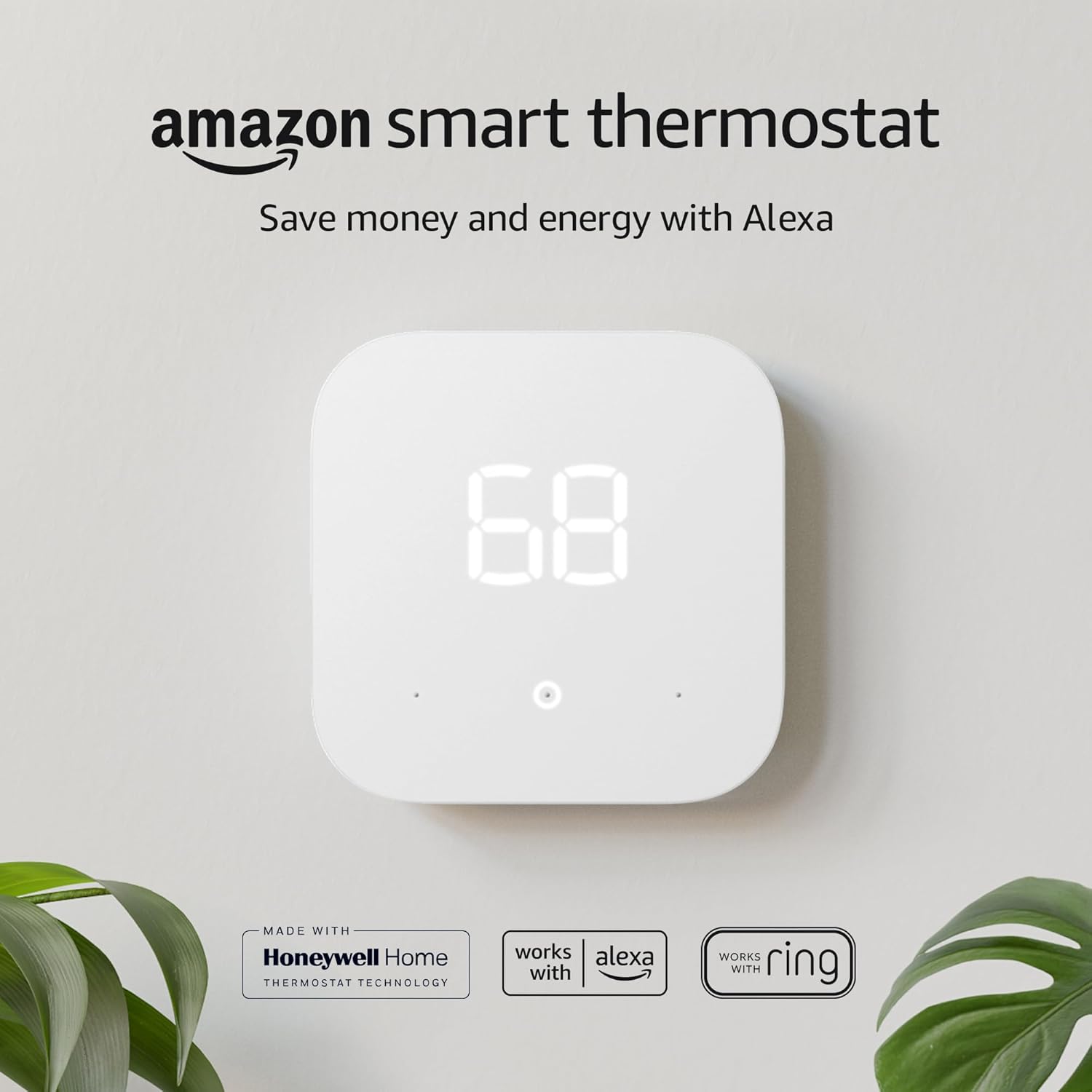
If you have the flexibility to choose either, buy the thermostat to match your walls — not because it is inherently a better approach, but because there are far more thermostat finish options than there are paint colors that work for every possible thermostat. If your walls are already a color you love, the right smart thermostat in a compatible finish can be found within any major product category. The Google Nest Thermostat, for instance, is available in Snow, Sand, Charcoal, and Fog — covering the most common wall color families. See our comparison of Nest vs. Amazon Smart Thermostat for a breakdown of available finishes and compatibility.
Can I paint my thermostat to match my wall?
Yes, but with important caveats. You can paint the removable outer cover of many traditional thermostats using latex paint in the wall color — simply remove the cover plate, lightly sand it, prime it with a plastic-compatible primer, and apply the wall paint. This produces the most complete camouflage effect available. Do not paint the thermostat body itself (the housing containing the electronics), and check your manufacturer’s warranty before proceeding. Smart thermostats should not be painted, as their displays and sensors require clear, unobstructed surfaces.
What is the best wall color if I have a multi-zone HVAC system with multiple thermostats?
Homes with multiple thermostats — often the case in split HVAC systems — face a compounded version of the standard thermostat visibility problem. The most practical approach is to ensure all thermostats in visible areas are of the same model and finish, allowing a single wall color to harmonize with all of them simultaneously. If different zones require different thermostat models, a warm neutral (greige or soft warm white) is the most reliable common denominator across all finish types.
My thermostat is located directly on my accent wall. What should I do?
An accent wall location is the most challenging scenario for thermostat camouflage because accent walls typically feature the boldest or most saturated color in the room — exactly the condition most likely to create high contrast against a white thermostat. There are three solutions, in ascending order of commitment: (1) Install a decorative frame that converts the thermostat into a visual accent element compatible with the bold wall color; (2) upgrade to a smart thermostat with a finish that harmonizes with the accent wall color; or (3) choose the accent wall color with the thermostat’s finish in mind from the outset.
I have a rental apartment with white walls. Is there anything I can do?
White-walled rentals are actually the most favorable environment for white thermostat camouflage — the device and the wall share the same general color family. The main issue is usually a mismatch in undertones (a warm off-white thermostat on a cool bright white wall). In this case, a decorative surround in a warm finish — brushed brass, antique gold, or warm wood — can reframe the thermostat as an intentional accent against the white wall, effectively converting the contrast from a visual problem into a design feature. Removable peel-and-stick wallpaper in a warm, textured pattern behind the thermostat is another excellent renter-friendly option.
Does wall color affect my thermostat’s temperature readings?
Potentially, yes — though the effect is usually minor and correctable. Thermostats measure ambient air temperature, but dark wall colors absorb and re-radiate heat differently than light colors. A thermostat on a very dark-painted wall that receives direct sunlight may read slightly higher than actual ambient temperature due to radiant heat from the warm wall surface. If you are installing a dark-colored wall in a room where the thermostat is affected by direct light, check the thermostat’s accuracy with a separate thermometer after installation. Our guide on why your thermostat shows the wrong room temperature covers this and other calibration issues in detail.
What about two-tone walls — can I use a different color directly behind the thermostat?
Two-tone wall treatments — where the lower half of the wall is painted differently from the upper half, separated by a chair rail or applied molding — can be used strategically to place the thermostat in the lighter-toned zone of the wall, regardless of what color the upper portion carries. This approach is most effective in hallways, where a chair rail at thermostat height creates a natural visual division. Paint the lower zone in a warm neutral that harmonizes with the thermostat, and apply your bolder color choice above the rail. The thermostat effectively disappears into the lower zone while the upper zone delivers the design impact you want.
Is a smart thermostat worth buying just for the design upgrade?
The design benefit is real, but smart thermostats offer considerably more than visual improvement. Beyond appearance, they can deliver meaningful energy savings through scheduling, adaptive learning, and remote control via smartphone. For homeowners weighing the cost of a new thermostat against the design benefit alone, our guide to 2026 smart thermostat rebates explains how utility rebate programs can offset a significant portion of the purchase price — sometimes making the upgrade essentially free.
What finish sheen should I use on the wall behind the thermostat?
Matte finish is the best choice for thermostat camouflage in any room where washability is not a priority (living rooms, bedrooms, hallways, offices). The flat surface minimizes shadow definition around the device’s edges and reduces its apparent three-dimensionality. For kitchens and high-traffic areas where washability is required, eggshell is the next best option — it adds only slight sheen while remaining more cleanable than matte. Avoid semi-gloss and gloss in areas where thermostat camouflage is the goal unless you are using a decorative cover to manage the shadow gap.
What is the single best wall color for thermostat compatibility across all room types?
If forced to recommend one color for universal thermostat compatibility, most professional designers would choose Agreeable Gray (SW 7029) by Sherwin-Williams. It is warm enough to harmonize with off-white and beige thermostat casings, neutral enough to avoid clashing with cool-toned devices, light enough to stay below the value threshold where high contrast becomes a problem, and versatile enough to work in every room orientation and lighting condition. It is also, perhaps not coincidentally, the best-selling paint color in the United States — a designation that reflects precisely the kind of universal, adaptable quality that thermostat-compatible wall colors require.
Conclusion
The Art of the Invisible Thermostat
The thermostat has been an afterthought in interior design for as long as homes have had them. It is installed by an HVAC technician at a height determined by code, in a location determined by the mechanical system, in a finish determined by the manufacturer — and then left there, permanently, for the homeowner to work around.
But it does not have to be this way. As this guide has demonstrated, the relationship between wall color and thermostat visibility is not random or arbitrary. It is governed by consistent, learnable principles — principles of contrast, undertone, value, and finish that apply to every room, every thermostat model, and every paint color. Once these principles are understood, choosing the right wall color becomes not a matter of luck but of knowledge.
The ideal wall color behind a thermostat is one that makes the device seem like it has always belonged there — not hidden, not highlighted, but integrated. When the color is right, visitors to a room will not notice the thermostat. They will simply feel that the room is well-considered, that the walls are beautiful, that the details have been attended to.
That is the quiet, invisible satisfaction of a design decision made well.
Continue your thermostat research: 25 thermostat cover ideas · hide thermostat wires · buying a smart thermostat · best thermostats for energy savings
— End of Guide —
All paint colors mentioned are registered trademarks of their respective manufacturers.